Showing posts with label black. Show all posts

Monday, July 10, 2023

Benartex Ambassador Project #3

 Christmas in July is celebrated by 
lots of quilters to get a jump on
their Christmas gift lists, so
I am going to offer 2
Christmas in July patterns
for my Benartex projects!

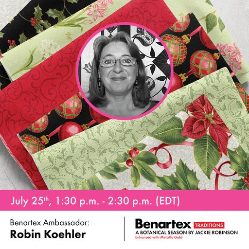
For project #3 I chose
to work with the new
line, Rhapsody in White,
arriving in shops now.
This line has a lovely
silky feel to it and there
are lots of cute
prints to choose from.
White makes me think of 
snowflakes though and how 
fun are those little
paper cut ones from 
our childhood.

In all honesty, I was never 
much good at getting them 
to look pretty, and I 
have worked very hard
to make the ones
pattern easy and cute!


The designs can be single
or layered as shown and
explained in the 
pattern instructions
found HERE.


These will become
timeless family gifts,
used every year.
Use them for pillows,
tote bags, candle mats,
mug rugs, Santa's
cookie mat....
The list is endless!
Come see how I used this
line in another project HERE 
to create a matching set!


Thursday, February 20, 2020

WHERE LOVE GROWS

Thank you SIMPLY MODERNE for publishing this fun 
combination of paper piecing and applique'.
 Meet WHERE LOVE GROWS!
I did pretty well matching my colors
to make it cheerful.
Paper piecing trick: 
I collect notions and such and one of 
the items are the old heavy metal irons.
They are great weights for pressing
a pile of paper pieced blocks FLAT!!

There is an addition of some bias strips 
to the simple paper pieced blocks 
 to create the larger branches. 
I also stitched in some 
little skinny ones for texture.
Then my favorite part...the APPLIQUE'!!!
This is raw edge applique' where wavy lines
were added to the vines for texture .

Lastly, my label.
Here is my lazy label trick...
Fold a square in half to create a triangle, place the 
raw edges of the triangle within the binding 
seam allowance and stitch in place with 
a 1/8" seam just to hold until the binding is added.
THEN, use a sharpie or micron pen to write on it.
Of course the more I look at this photo, pretty sure
I skipped the triangle and wrote directly on that back.
Take that for lazy:)

 Here is the cover of Issue #20 of 
where you will find
WHERE LOVE GROWS.
Isn't that cover quilt gorgeous too?!!

Saturday, December 14, 2019

'Currant Pinwheels' in Simply Vintage!

Thank you all for sticking through 
some of the boring posts this past week
and here is your reward:)
 Here is the new issue of Simply Vintage
one of my Favorite publications!!
Inside you will find a sweet
red and green treat based on
this antique quilt below.
 This is Coxcombs and Currants which I own.
I thought I would try designing a 
smaller piece inspired by the quilt
but in a different colorway.
 These are some of my other 'go-to' 
colors; red, orange, black.
 I really like the small loop design within the leaves.
This one was all done by machine but
felt a bit too small so.....

 I started picking out my red, green, 
and white fabrics for a more traditional 
look to match the original quilt.
 This time I did all the work by 
hand (applique and quilting).


 I really enjoy the look of straight 
lines against curved lines.
Someone commented on the unique 
use of leaves on only one side of the 
vine vs. both sides as we traditionally see.
 I really wanted that FRAME appearance.
Then look how absolutely lovely
they staged it in the magazine!!
Thank you Simply Vintage and the 
whole Quiltmania staff!

I can't wait to see what other
colors people do this in!
Keep stitching~R


for more blogs to follow.

Tuesday, September 2, 2008

Pick one color

Under my 'Creative Living' post (7/31) there is a black, white, and blue piece. Both that piece and the piece seen here resulted from the work-for-trade (7/21) piece that I made. Once I got going, I really enjoyed working in a series and seeing what else I could do with a limited color palette.

The original piece is named "Pine Knoll Blues" after the beach where the photo was taken. The second piece is named "Which Way to the Beach" since it is an abstract of a traditional quilt block named flying geese. The piece directly below is named "Blue Peacock" because it reminds me of a back view of a peacock tail. There are quilted feathers as well.


I started the original project timidly because I worried that a limited color palette would stifle my thought process. The opposite actually happened and now I am looking at my fabrics for the next color to play with.

Wednesday, August 13, 2008

Help me name this.

A few months ago I started the process of a fiber postcard trade with a fiber artist in South Carolina, Susan Lenz. You can read more about her vision at http://cyberfyberexhibitionpostcards.blogspot.com/ I have completed my postcard to send back to her, and

I would really like to have a name for it since it will be part of a gallery exhibit, but I keep drawing a blank since abstract is not my strength. The colors and the translucency make me think of wispy sunset clouds when the moon is still visible.


Any fabulous ideas?